How to think about HTML responsive images
The days with an immobilized knee are long and I’ve just read through the Images section of the HTML Standard, as one does, hoping to better understand how responsive images work.
What’s a responsive image?
The term responsive image encompasses two complementary approaches.
In the context of responsive web design, a responsive image is one that’s made fluid with the width, height, aspect-ratio, and object-* properties, as part of CSS layouts that change with the viewport size and other media conditions.
But what the HTML Standard is concerned with, and what this article talks about, are the so-called “adaptive images” enabled by the srcset and sizes attributes on <img>, and the dedicated <picture> and <source> elements. These HTML features help the browser pick the most appropriate image content for the current environment.
Here’s how I made sense of responsive image content, progressing from simpler to more complicated — and then back to simple.
Level 1: one image, one resolution
Let’s start with the simplest image markup:

<img src="puppy.jpg" alt="A black and white pupper, glancing inquisitively">In the absence of any attributes or styles to dictate otherwise, puppy.jpg renders at its natural width and height, 120px by 150px in CSS pixels.
A CSS pixel is defined as the visual angle of one pixel on a device with a device pixel density of 96dpi and a distance from the reader of an arm’s length
or about 0.0213 degrees.
Modern phones are used at a much smaller distance than arm’s length. Their screens need to have a greater density to look good: the visual angle of 0.0213° at a distance of 50 centimeters computes to a pixel on a 137ppi (pixels per inch) display.
The 2556×1179px physical resolution of an iPhone 15, packed in a display that measures 6.1 inches diagonally, gives it a pixel density of 460 ppi. That’s more than three times denser than our nominal CSS display. The iPhone can therefore comfortably use three device pixels to draw each CSS pixel, and web content will have more or less the same size as when viewed on a regular monitor placed further away.
This ratio between a device pixel and a CSS pixel is called the device pixel ratio and is available on window.devicePixelRatio. The device pixel ratio is not a fixed measure of the capabilities of the physical display. The display resolution chosen by the user, or zooming in and out of the web page, can also influence the ratio. Zooming into the page makes for fewer, larger CSS pixels, so the device pixel ratio increases.
Back to our image. On devices that have a device pixel ratio of 2 or 3 (usually called retina displays regardless of brand), the image looks blurry at its natural size: the display can potentially use two or three separate device pixels in the space of a CSS pixel, but we only give it one image pixel to draw. On these denser displays, the image looks better when scaled down to increase its density to match that of the display. When one image pixel becomes one device pixel, instead of two or three, the image is as crisp as it gets.
<img src="puppy.jpg" width="120" alt="…"> <!-- 1x -->
<img src="puppy.jpg"  width="60" alt="…"> <!-- 2x -->
<img src="puppy.jpg"  width="40" alt="…"> <!-- 3x -->
The same 120px by 150px image is rendered at its natural size, then scaled down in half, and finally to 1/3 of its natural width.
The rendered size of an <img> element can be adjusted with the width and height HTML attributes, or with equivalent CSS properties.
It’s best to include explicit width and height attributes on the <img>. That way the browser can leave room for the image beforehand and prevent layout shifts as the image loads. It also helps presentation in contexts that don’t ship the author’s CSS, such as RSS feeds. (I can count at least three feeds in my reader with huge, distracting icons that are, no doubt, stray images without sizing attributes.)
Level 2: one image, many resolutions
For a sharp image on displays of various densities, shrinking the same image file to various degrees to increase its density is insufficient. We need commensurately larger images that pack more detail.
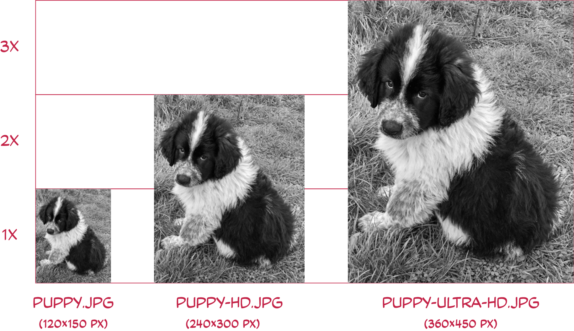
Images with progressively larger resolutions, representing the same content.

<img src="puppy.jpg" width="120" alt="…"> <!-- 1x -->
<img src="puppy-hd.jpg" width="120" alt="…"> <!-- 2x -->
<img src="puppy-ultra-hd.jpg" width="120" alt="…"> <!-- 3x -->The srcset attribute lets you pack all the images on a single <img> tag, and let the browser choose the most appropriate for each situation.
<img
	srcset="puppy-ultra-hd.jpg 3x, puppy-hd.jpg 2x"
	src="puppy.jpg"
	alt="…"
>
Each entry in srcset has a pixel density descriptor: a floating-point number followed by the unit x. The descriptor next to each image source declares the image density at which that source is meant to be rendered. If omitted for a source, a 1x descriptor is assumed.
The src attribute on the <img> is both a fallback for browsers that don’t support srcset (a vanishingly small lot) and a contribution to the set of image source candidates with an implicit 1x pixel density descriptor.
The browser will select the most appropriate image source out of the set of candidates, based not only on the display density, but possibly other factors such as network speed and mobile data preferences. This choice is made in an implementation-defined manner
, meaning the browser is free to choose whatever it thinks works best.
In the absence of width and height HTML attributes to dictate otherwise, whatever image source is selected will be rendered at its density-corrected natural dimensions, which are the image’s natural dimensions divided by its declared density. The density-corrected natural dimensions can be accessed on the DOM object’s naturalWidth and naturalHeight properties:
img.naturalWidth === intrinsicWidth / density;
img.naturalHeight === intrinsicHeight / density;
At 1x density, the element’s density-corrected natural dimensions correspond to the file’s natural (intrinsic) dimensions. At 2x density, the image is rendered at half the number of CSS pixels as the file’s natural dimensions.
Because of the way we’ve generated our three images and declared their intended densities, they all render at a width of 120px, regardless of which image source the browser chooses. So there’s no issue with adding the recommended explicit width and height attributes:
<img
	srcset="puppy-ultra-hd.jpg 3x, puppy-hd.jpg 2x"
	src="puppy.jpg"
	width="120"
	height="150"
	alt="…"
>
To tell which image source the browser has chosen at any given point, look at the currentSrc property on the image element.
Level 3: dynamic image density
The srcset attribute with pixel density descriptors works well for images that are meant to be displayed at their (density-corrected) natural size.
But images often participate in responsive layouts and are made fluid with CSS, so an image renders at various densities depending on the layout. On a large screen, the image may be part of a three-column layout. On a smaller screen, the layout may collapse to a single column with full-width images.
This is a case where the image density changes but the display density doesn’t, so srcset with density descriptors won’t cut it.
There’s a second way we can use srcset. To help the browser choose an image source of appropriate density when media conditions change, we can swap our density descriptors for a combination of width descriptors and a separate sizes attribute.
Instead of describing the intended image densities, width descriptors (using the w suffix) declare the natural (intrinsic) width of each of the image sources.
This information, by itself, is not enough for the browser to make a meaningful choice. It needs to know how the image is going to be laid out. This is accomplished with the sizes attribute, which declares the layout width of the image in one or more media conditions.
<img
	 srcset="
		 puppy-ultra-hd.jpg 360w,
		 puppy-hd.jpg 240w,
		 puppy.jpg 120w
	 "
	 sizes="(min-width: 400px) 10em, 80vw"
	 alt="…"
>
The srcset attribute declares three image sources using width (w) descriptors: one 360px wide, one 240px wide, and a final one 120px wide. The sizes attribute describes how the image is laid out: on devices wider than 400px, they are rendered at a width of 10em, otherwise they occupy 80% of the viewport width.
We’re free to declare the layout width with any CSS unit for <length>, and use calc() and other math functions, to try to roughly match the image’s actual layout width.
Percentages aren’t allowed in the
sizesattribute, as they wouldn’t match the usual understanding of percentage of the parent’s width. Remember that choosing image sources for eagerly-loaded images happens before layout, so we can only refer to things known beforehand, such as the viewport’s dimensions.As we’ll see later on, lazily-loaded images, which are fetched after layout, don’t need to juggle any of this
sizesstuff.
The purpose of the sizes attribute is to help convert width descriptors to density descriptors. Width descriptors are turned into density descriptors by:
- identifying the size that matches the current media conditions among the values in
sizes; - resolving the size value to CSS pixels;
- dividing the declared width by that amount of pixels.
The density computed from a source’s width descriptor and a layout size is called the source’s effective density.
In a larger viewport that’s, say, 1920 pixels wide, our image is intended to be displayed at a width of 10em, which computes to 10 * 16px = 160px in CSS pixels. The large image source, having a declared width of 360px, when rendered 160px wide, will have an effective density of 360/160 = 2.25. The medium and small images will have effective densities of 1.5 and 0.75 respectively. On this viewport width, the equivalent srcset with density descriptors is:
<img
	 srcset="
		 puppy-ultra-hd.jpg 2.25x,
		 puppy-hd.jpg 1.5x,
		 puppy.jpg 0.75x
	 "
	 style="width: 10em"
	 alt="…"
>
In a smaller viewport that is 300 pixels wide, our images are meant to be displayed at 80vw, which computes to 300px * 80/100 = 240px CSS pixels. In these media conditions, our three image sources will have effective densities of 1.5, 1, and 0.5 respectively. On this smaller viewport width, the equivalent srcset with density descriptors is:
<img
	 srcset="
		 puppy-ultra-hd.jpg 1.5x,
		 puppy-hd.jpg 1x,
		 puppy.jpg 0.5x
	 "
	 style="width: 80vw"
	 alt="…"
>
Therefore, srcset with width descriptors, combined with sizes, is a way to assign a dynamic density to image sources, roughly based on how the image is laid out in various media conditions.
When srcset uses width descriptors, the image’s src is purely a fallback for browsers that don’t support it. The attribute can’t contribute an image source, because there’s no way to attach a width descriptor to its value.
The two srcset flavors are both ultimately resolved to a set of image sources with density descriptors, but they don’t mix well. You can’t use width descriptors for some sources and density descriptors for others in a single srcset. Either use width descriptors with the sizes attribute, or density descriptors without the sizes attribute. In the former case, sizes is necessary; in the latter, it serves no purpose and is ignored.
Don’t rely on the default. When we say
sizesis required for width descriptors, it means a HTML document omitting it won’t validate and it won’t be canon. But HTML is tolerant of author errors and defaults to a value of100vw. As Eric Portis explains, you don’t want to rely on that default, as it potentially nudges the browser to fetch images much larger than needed, defeating the whole purpose of the feature.
Level 4: the <picture> element
The srcset attribute on the <img> merely provides a set of candidate sources to the browser, along with enough information about them to allow for an informed choice. As Mat Marquis writes in the Learn Images course, it makes srcset a descriptive syntax. It says to the browser: here’s what I have, now you pick!
There’s another HTML feature with which we can be more prescriptive and say only consider these image sources if these conditions are met
. This is done with one or more <source> elements associated with the <img> by virtue of being wrapped together in a <picture> element:
<picture>
	<source …>
	<source …>
	<img …>
</picture>
The <picture> element is a container that augments its inner <img> by providing more sets of image sources to choose from, declared with <source> elements. If the browser doesn’t support these elements, no harm is done: they’re ignored and the <img> works as if it were alone.
(You might say <picture> is the original HTML web component, but that’s an angle for another day.)
Like image elements, <source>s use the srcset and sizes attributes to declare their set of image sources. In addition, <source> elements accept two attributes that condition their contribution:
- the
typeattribute declares the media type of the image set, so that the browser can skip image formats it doesn’t understand; - the
mediaattribute declares the media conditions where the image set makes sense, which the browser skips if they don’t apply.
The first source that matches the current media conditions and media type capabilities defines the set of image candidates that’s supplied to the <img> element. The browser chooses the most appropriate image from that set, just as if the source’s srcset and sizes attributes had been declared on the <img> itself.
If no sources apply to the current circumstances, the image’s own srcset or src is used as a fallback.
The type attribute
The type attribute enables us to serve newer, more efficient image formats to supporting browsers without ruining it for the others. If a browser can’t use image/avif, or image/webp it can just ignore the respective <source> elements.
<picture>
	<source srcset='puppy.avif' type='image/avif'>
	<source srcset='puppy.webp' type='image/webp'>
	<img src='puppy.jpg' alt='…'>
</picture>
Serving newer image formats safely with <source> elements with a type attribute. If we omitted the type attribute, or used puppy.avif and puppy.webp directly in the image’s srcset attribute, unsuspecting older browsers would fetch formats they don’t understand, resulting in a broken image.
The media attribute
The media attribute can contain any media condition. We could, for example, serve an alternative image for dark mode, and a higher-contrast version appropriate for printing.
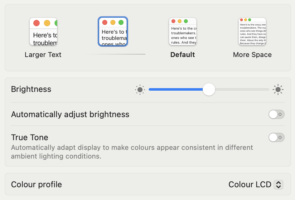
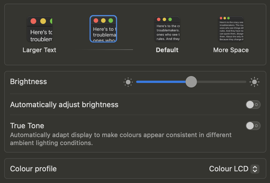
Three styles for illustrating a portion of the macOS display settings: light mode, dark mode, and high-contrast mode.
<picture>
	<source media='(prefers-color-scheme: dark)' srcset='macos-dark.png'>
	<source media='print' srcset='macos-contrast.png'>
	<img src='macos-light.png' alt='…'>
</picture>
A <picture> element uses the three styles in <source> elements, with the appropriate media queries. Above the code: Live picture, as chosen by the browser. Try switching to dark mode, or print-previewing the page to see the effect.
The same rules for srcset and sizes apply to <source> elements: you can’t mix density descriptors and width descriptors in a single srcset, and you must use the sizes attribute with, and only with, width descriptors.
<source> elements also have rules of their own:
- each
<source>must generally have some sort oftypeormediacondition, or both, attached to it. Only if the image itself doesn’t have asrcsetalready, one bare, conditionless<source>is allowed. - there’s no
srcattribute on<source>because it would be confusing and besides, any validsrccan be plopped intosrcsetinstead.
Level 5: art direction
While a srcset is meant to represent the same image content at different scales, multiple <source> elements can represent different content altogether. In the previous example, we used the media attribute to serve images styled according to user preferences.
The different images don’t need to have the same aspect ratio. In fact, there’s nothing stopping us from serving radically different images in various scenarios. On a large screen, a photograph could be a wide shot of the subject, while on smaller screens that can be cropped closer to the action.
The technique is often called art-directing responsive images.
Since setting the width and height on the <img> element is important, it seemed like a great idea to add support for width and height attributes on <source> elements. The dimensions can then be imparted to the image element when the source is selected. (The case for sources also getting their own alt attribute is still being made.)

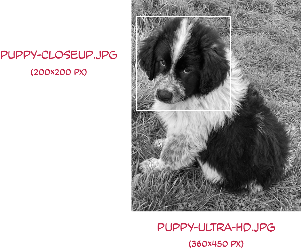
<picture>
	<source srcset="puppy-closeup.jpg" width="200" height="200" media="(max-width: 40em)">
	<img src="puppy-ultra-hd.jpg" width="450" height="600">
</picture>
An art-directed responsive image displays a close-up of the subject when the viewport is less than 40em (640px) wide. Notice the width and height attributes on the <source> element.
Cropping after image load: Images can also be art-directed with CSS using the
object-fit,object-position, andobject-view-boxproperties. However, to the extent that is practical, using<picture>to serve the pre-cropped images saves some bandwidth and compute energy.
Extra credit: lazy images with sizes=auto
As promised in the introduction, we end with a bit of respite from the complexity of responsive image markup.
A recent addition to the HTML Standard allows lazily-loaded images to ditch the arduous, hand-coded, approximated values in the sizes attribute. Instead, with the auto value, the browser uses the image’s actual layout width to compute more accurate densities for the image candidates.
Eric Portis covers the feature and its caveats in admirable detail. I won’t repeat the points here, because this thing is already getting too long.
How browsers choose one image
Now that we’ve covered the theory of providing image source candidates, let’s find out how browsers actually pick the most appropriate one.
I’ve run a couple of quick tests on MacBook Pro and iPhone, and dipped into browser source code to confirm the behavior (insofar as I am looking at the right code to begin with).
Density descriptors in srcset

The image above uses several image sources of 300×200px constant size, but labeled and declared with density descriptors ranging from 0.1x to 4x in the srcset attribute. This shows us which source the browser picks. Test: image density selection.
Firefox. At 100% zoom, the device pixel ratio is 2. Zooming in and out of the page updates the DPR and re-fetches the image with the smallest density that’s higher than the current DPR, or the highest density available when all densities are too small. Relevant code in Responsive.
Chrome. The browser selects the image with the density closest to the DPR when loading the page. Zooming in and out of the page updates the DPR, but the browser will only fetch another, more appropriate image on page refresh. It will also prefer the densest image source it has in its cache, even if its density is much higher than needed. Relevant code in html.
Safari. The DPR is fixed to a value of 2 on the MacBook and 3 on the iPhone. Zooming in and out of the page doesn’t update the DPR or fetch another image. Like in Firefox, you get the image with the smallest density that’s higher than this fixed DPR. Relevant code in HTML.
All in all, given the browser algorithms, every image source is evaluated, and the order in srcset doesn’t affect the choice. Do keep in mind that only the first item for each particular density (be it declared density or effective density) is kept, and any duplicates are pruned.
As far as I can tell, browsers aren’t currently applying any of the sophisticated decision-making envisioned by the HTML Standard. An image density close to the current DPR is always favored.
With the exception of Firefox, which responds to zooming, browsers stick to their choice of image source throughout the page session. Pinch-zooming does not affect DPR in any browser, so raster images don’t get magically enhanced if you pinch into them (this is by design).
Width descriptors in srcset

The image above uses several image sources with the same aspect ratio but different scales, labeled and declared with width descriptors ranging from 300w to 3000w in the srcset. The declared layout width of the image is sizes="100vw". This shows us which image source the browser picks.
(Note: To make it fit in the article’s layout, the image is made responsive with max-width: 100%; height: auto. Open the test in a separate tab to evaluate more accurately: Test: image width selection)
When using width descriptors in srcset, we expect the browser to factor in the sizes attribute (here having a value of 100vw) to compute density descriptors that update along with the viewport. It’s no surprise then that browsers behave more or less like with density descriptors, with the added benefit that the image sources get re-evaluated more often.
Firefox. Resizing the browser window causes the browser to choose the image with the appropriate effective density at any given moment. Zooming in and out of the page re-evaluates things but generally doesn’t produce any effect: while the size of the CSS pixel increases (and with it, the DPR), 100vw evaluates to fewer CSS pixels, which results in more or less constant image density throughout.
Chrome. Like in Firefox, resizing the browser window causes the browser to re-evaluate the image sources based on their effective density. As seen with the density descriptor test, Chrome caches the images it fetches and always uses the densest available. Once fetched for a large viewport, a dense image will be used even as you shrink the viewport.
Safari is the most conservative about fetching other images. With sizes="100vw", the image source is evaluated once on page load, and resizing the browser window has no effect. With an attribute that contains media conditions, such as sizes="(max-width: 400px) 25vw, (max-width: 800px) 50vw, 100vw", it re-evaluates the image sources once a different size applies.
Safari’s approach means sizes="100vw" does not make an image fluid like in the other browsers, which update the density-corrected natural dimensions after each resize. The dimensions are only computed once, when the source is first rendered.
Conclusion
I haven’t included more elaborate browser tests because they make my brain hurt, but we’ve hopefully made sense of how HTML responsive images are specified to work and got a glimpse of how current browsers choose image sources.
Responsive images have been available in HTML for a decade. They have been written about extensively, often covering the same ground and angle. Here are some pointers:
- Learn images by Mat Marquis
- Srcset and sizes (2014) by Eric Portis
- Responsive Images 101 (2015), a ten-part series (and book) by Jason Grigsby
- Eric Portis’s Observable notebook
wdescriptors andsizes: Under the hood explains these concepts and behaviors with nice-looking, interactive browser tests.