Sizing images based on their aspect ratio
Grids of logos are my nightmare.
I mean, never mind the opportunity to learn the bewildering, but admittedly finite, array of file formats in which visual assets can conceivably be stored and distributed. But the intricate dance of making all logos look equally prominent in the grid is something for which I can only muster very little enthusiasm.
Like with all tedious things, I've found myself wishing more than once that CSS included a declarative way to make images of various aspect ratios look the same size.
Making images „look the same size”
A definition of that might be to make the images occupy the same surface area. Let's work out the math.
We want to keep constant the area of an image of natural width W and height H. To that end, we must find its preferred dimensions Wp and Hp so that Wp × Hp is uniform across images. The givens:
area = Wp * Hp;
aspect_ratio = W / H = Wp / Hp;
…ultimately lead to the formula below. (Individual steps are left as an exercise to the reader.)
Wp = sqrt(area) * sqrt(W / H);Let's express this formula in HTML and CSS.
You should already have explicit width and height attributes on <img> elements in your markup to define the intrinsic size of the image and prevent layout shifts as the image loads. The values of these attributes cannot be used in CSS directly, so we also pass them as custom properties via the style attribute.
<div class='ratio-gallery'>
	<img
		src='https://source.unsplash.com/random/800x600'
		alt='800 by 600 pixels placeholder image'
		width='800'
		height='600'
		style='--w: 800; --h: 600'
	/>
</div>
Note that we're passing the width and height as unitless numbers. This gives us the most flexibility when using the values in CSS math functions. The sqrt() function, in particular, only accepts <number>s. Our basic CSS looks like this:
.ratio-gallery {
	--basis: 300px;
}

.ratio-gallery img {
	--w: 1;
	--h: 1;
	width: calc(var(--basis) * sqrt(var(--w) / var(--h)));
	height: auto;
}
Instead of defining an --area constant like in our math formula, we use its square root directly as --basis. This has the added benefit of being more intuitive: you can think of its value as making the image as large as a square of that side length. For example, --basis: 300px makes the image as large as a 300×300 square.
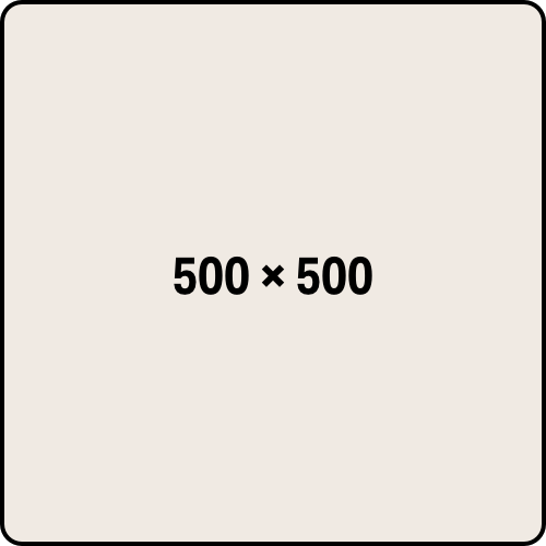
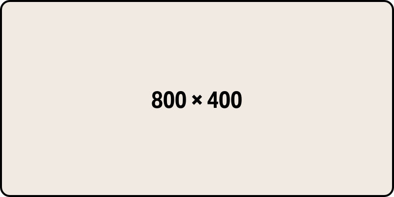
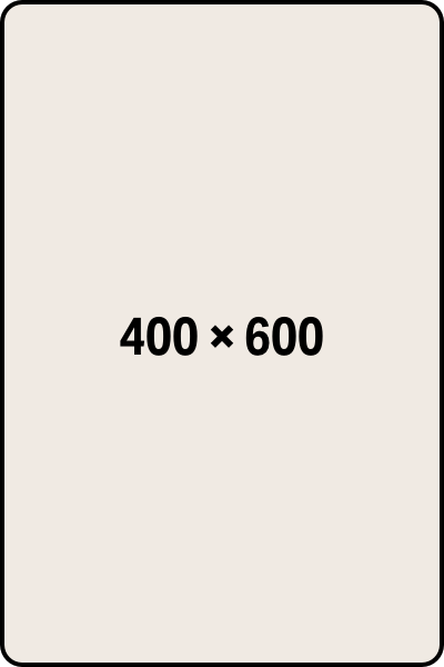
That's pretty much all there is to the technique. Below are some images sized with it, placed in a flexbox container. In a browser that supports the sqrt() CSS function — which, at the moment of writing, is just Safari — you should see three images of identical surface areas:
Fallback to a fixed aspect ratio
The following @supports at-rule will check if the browser supports the sqrt() CSS function:
/*
	To detect support for `sqrt()` we use `flex`,
	the shortest (afaict) CSS property that accepts
	the `<number>` value that `sqrt()` produces.
 */
@supports (flex: sqrt(0)) {

}
In browsers that don't support this function, we could enforce a fixed aspect-ratio and use the object-fit property to clip the image to fit, as described by Michelle Barker. To make the fallback comparable, we do have to precompute the square root of this fixed aspect ratio and factor it in — not ideal, but not exceedingly annoying. Here's the technique along with the fallback:
.ratio-gallery {
	--basis: 300px;
}

.ratio-gallery img {
	--w: 1;
	--h: 1;
	width: calc(var(--basis) * sqrt(var(--w) / var(--h)));
	height: auto;
}

@supports not (flex: sqrt(0)) {
	.ratio-gallery img {
		width: calc(var(--basis) * 1.224 /* = sqrt(3/2) */);
		aspect-ratio: 3/2;
		object-fit: cover;
	}
}
Here is a more developed demo:
Wrapping up
Turns out aspect-ratio-aware sizing is not too hard to pull off as long as we have control of image dimensions in the markup. The technique may be especially useful in content management systems where authors are able to upload arbitrary assets that need to look good next to each other, and where the author is not expected, or is unable, to fine-tune the sizes via custom CSS.
Addenda
Defensive CSS
As Šime helpfully points out, the basic technique does not handle extreme aspect ratios well. In fact, the arbitrary in arbitrary aspect ratio is the cue to put our defensive CSS hat on.
We can limit the space the image takes in any one direction with max-width and max-height:
.ratio-gallery img {
	--w: 1;
	--h: 1;
	width: calc(var(--basis) * sqrt(var(--w) / var(--h)));
	height: auto;
	max-width: calc(var(--basis) * 2);
	max-height: calc(var(--basis) * 2);
}
(You might also want to throw in an object-fit: cover to handle very tall images that get squished when max-height kicks in.)
Here is the demo again, which includes the defensive CSS:
Prior art
Update Dec. 2022: Piper Haywood had described back in 2020 a technique for sizing images using the sqrt() CSS function, at a time when the function was not yet supported in any browser. Nick Sherman produced a nice demo for the technique, using an approximation of sqrt().